
Controversial for sure in the color world, but super fresh and clean for the new year. This signifies a fresh approach to thinking, to living, to being a little quirky. Coming from the heavier, somber colors of the past several years, these two colors are refreshing and light. And, they pair well with the Sherwin Williams color of the year: Alabaster. If you are looking to freshen up your home or vacation home in Winter Park, CO give me a call for a complimentary Color It! consultation. Enjoy the read and let me know what you think of these selections.
Pantone Has Spoken: Rosy and Serene Are In for 2016.
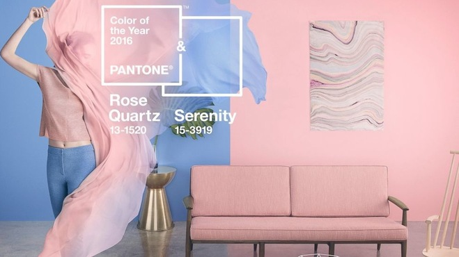
“It’s another year and another controversial choice for color management company Pantone, which has released its picks for the top trending colors of 2016. It’s a pair of pastels that at first glance scream, “It’s a boy! And a girl!”
But the soft purplish-blue (Serenity) and nude-pink hues (Rose Quartz) represent a blending and blurring of gender lines, says Leatrice Eiseman, executive director of the Pantone Color Institute. “In many parts of the world we are experiencing a gender blur as it relates to fashion, which has in turn impacted color trends throughout all other areas of design,” Eiseman says.”
Click here to continue reading the full article on Houzz.
Recent Comments